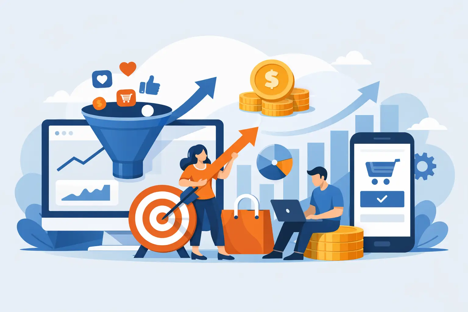
You have website traffic, you publish content, and maybe you even invest in Google Ads or Meta Ads. Yet inquiries are few and far between. The problem isn’t always how many people visit your site—it’s often that no one has designed a path to turn them into leads. Understanding how to improve your conversion rate means stopping paying to bring people to a digital storefront that doesn’t know how to sell.
A beautiful but inactive website isn't an investment. It's a fixed cost disguised as marketing. If 1,000 people visit your site every month and only 10 leave their contact information, you don't necessarily need to double your advertising budget. First, you need to figure out why the other 990 leave.
The conversion rate isn't a number you should check just once a month
The conversion rate indicates the percentage of users who take the action you're interested in: submitting a form, scheduling a call, calling, requesting a quote, making a purchase, or signing up for a demo. The formula is simple: conversions divided by visitors, multiplied by 100.
The hard part is deciding what really counts as a conversion. For an e-commerce business, it’s natural to focus on purchases. For a company that sells high-value services, a general inquiry isn’t enough: what matters is the qualified lead, someone who has a genuine need, a suitable budget, and the ability to make decisions.
This changes everything. A conversion rate of 10% may seem excellent, but it’s worth little if it generates ten off-target leads. Conversely, a 2% can produce much better results if it brings in solid deals every month. Don’t optimize for numbers that look good on a report. Optimize for the revenue that comes into the company.
Before optimizing, find the point where you're losing customers
Many companies change headings, button colors, and images without knowing where the user journey breaks down. This is the quickest way to create confusion and waste time. First, you need minimal but reliable data: which channel the traffic comes from, which pages users visit, what device they’re using, where they drop off, and what actions they take.
If people aren’t reaching the landing page, the problem may be the ad, the keyword, or the message used on social media. If they do reach it but stay for only a few seconds, the page isn’t delivering on the promise made before they clicked. If they read, scroll, and don’t fill out the form, the offer is weak, the request is too demanding, or there’s a lack of trust-building elements.
There is no one-size-fits-all solution. A local professional seeking phone bookings has a different sales funnel than a B2B company selling consulting services worth thousands of euros. But the logic remains the same: identify the friction, remove it, and measure the effect.
Track the conversions that generate real opportunities
Don’t just stop at counting the number of submitted forms. Also track clicks on the phone number, scheduled appointments, messages sent, and—when possible—the conversion from lead to sale in the CRM. If a campaign generates 50 inquiries but no sales negotiations, the problem might not be with the page—it could be the targeting, the offer, or how quickly the sales rep responds.
The data that matters is the one that links clicks, leads, and revenue. Without this chain, you're evaluating marketing based on gut feelings.
How to Improve Your Conversion Rate by Starting with Your Offer
Conversion rates rarely drop because a button is green instead of blue. They drop when a visitor doesn't understand, within a few seconds, why they should choose you and what to do next.
The first screen of the page should answer three questions: what you do, who you do it for, and what concrete results you can help achieve. Phrases like “innovative, tailor-made solutions” don’t really say anything. “We turn website inquiries into automatically scheduled appointments” is much clearer, because it addresses a problem and a result.
Also, avoid selling just technical features. Customers don’t buy a landing page, a CRM, or an ad campaign because they love the tools. They buy more appointments, less manual work, faster response times, and a sales process that’s less dependent on chance.
A strong offer reduces perceived risk. You can do this with an initial audit, a demo, a well-timed strategic call, a real-world case study, or a clear onboarding path. But be careful: giving everything away for free isn’t a strategy. If you attract people who are only interested in freebies, you’ll fill up your calendar and erode your profit margin. Your value proposition should filter prospects—not just collect leads.
Build pages that guide, not pages that distract
A landing page isn't just a shortened version of your website. It's a page with a single goal. If you ask a user to read your blog, check out five services, follow you on social media, and fill out a form, you're giving them too many options. And when a user has to choose from too many options, they often end up choosing nothing.
Keep your ad and landing page consistent. If the ad is about client acquisition for professional firms, the landing page should address that specific issue. Sending all traffic to the homepage is convenient for the site administrator, but not for those trying to convert visitors.
An effective structure is straightforward: a clear promise, a recognizable problem, the solution mechanism, concrete benefits, evidence, responses to objections, and a call to action. There’s no need to fill the page with graphic effects. What’s needed is to eliminate any doubts that prevent the next step.
Reduce friction at the decisive moment
A form with ten fields can filter out un serious leads, but it can also cause interested people to drop off. The choice depends on the value of the service and the volume of leads you can handle. For simple requests, ask only for the essential information. For a complex consultation, you can collect a little more information, but explain why you’re asking for it.
The call to action should also explain what happens next. “Submit” is a vague command. “Request an analysis of your funnel” or “Schedule an assessment call” makes the action clear. Then keep your promise: if you say you’ll get back to them within one business day, don’t respond after four.
Speed, mobility, and trust: the three "details" that aren't really details
Smartphone traffic often accounts for the majority of visits, but many pages are still designed primarily for desktops. Test the navigation on your phone as a customer would: Is the text readable? Can you find the button right away? Can the form be filled out without errors? Is the phone number clickable? If the answer is no, you’re paying for clicks that won’t convert.
Speed matters just as much. A slow-loading page conveys a sense of neglect even before the user reads a single word. Heavy images, unnecessary plugins, autoplay videos, and haphazardly installed tools drain attention and conversions. It’s not enough for the site to simply “open”—it must load quickly, especially on the pages where you’re investing your budget.
Trust, on the other hand, is built on verifiable elements. Reviews, results, examples of work, contextualized testimonials, a well-explained operational process, and clear references to the company help reduce uncertainty. Self-congratulatory statements aren’t enough. It’s easy to say you’re the best. Showing how you work is more convincing.
Follow-up is part of the conversion
A lead who fills out a form isn't a sale. It's someone who has given you a limited window of attention. If no one responds quickly, that window closes, and the lead will end up with the competitor who called back first.
This is where they come into play CRM, notifications, automated emails, and assignment workflows. Automation does not replace salespeople: It prevents the sales rep from forgetting about the lead, contacting them too late, or losing information along the way. An immediate confirmation, an internal reminder, and a well-timed follow-up sequence increase the chances that an inquiry will turn into a conversation.
For some activities, the automated response should simply confirm that the lead has been assigned. For others, it can already qualify the lead, suggest a calendar date, or send useful materials. It depends on the sales cycle and the complexity of the offer. The mistake is treating every lead with the same process, regardless of its value and urgency.
Test one variable at a time and ignore opinions
Optimization isn’t about redesigning the website every three months. It’s about formulating a specific hypothesis and testing it. For example: a headline that focuses on results might increase inquiries compared to one that focuses on the service. Or a shorter form might generate more qualified leads—not just more leads.
Change one variable at a time: headline, offer, call to action, testimonials, form, or page layout. If you change everything at once and the results improve, you won’t know what worked. If they get worse, you’ll have just spent money creating a new problem.
Don’t chase every minor fluctuation with ten visits a day. Testing requires sufficient traffic and time. With low traffic volumes, it’s often more useful to focus on the major factors: clarity of the offer, traffic quality, page speed, and sales management. These are the factors that truly drive results.
WebWakeUp focuses precisely on this continuity: websites, landing pages, advertising, CRM, and automation—not as disconnected pieces, but as a system to be measured and adjusted as the business evolves.
The next time a campaign yields poor results, don't immediately ask yourself if you need to invest more. Ask yourself how much each visit you're already paying for is worth, and what concrete, measurable obstacle is preventing that visitor from becoming a customer.